

 See My Latest Article on HelloNation
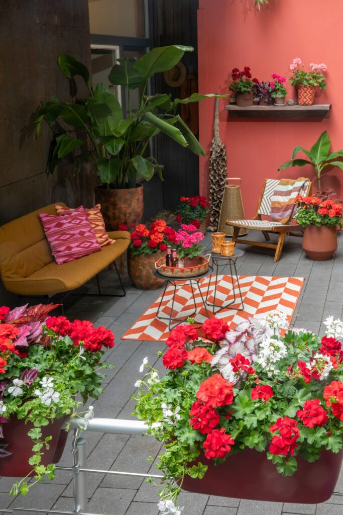
Why does color matter in an outdoor space?
Color affects how an outdoor area feels, how large it appears, and how well it connects with the home. In Columbia, SC, thoughtful color planning also helps outdoor spaces respond to strong sunlight, warm seasons, shaded areas, and the changing appearance of plants throughout the year.
Color does more than add decoration. It can:
- Make a small patio feel more open
- Give a large yard a stronger sense of structure
- Reduce the visual impact of heat-reflecting surfaces
- Highlight doors, paths, seating areas, or garden features
- Connect outdoor furnishings with the architecture of the house
- Make an area feel calm, energetic, private, or welcoming
A successful color plan usually includes a background color, one or two supporting colors, and a small number of accents. Using too many unrelated colors can make an outdoor space feel cluttered, especially when plants, fencing, masonry, and existing building materials are already part of the composition.
How should a color scheme begin?
Start with the permanent elements that are difficult or expensive to change. These may include the exterior siding, brick or stone, roof, concrete, decking, fencing, retaining walls, and the color of nearby structures.
These fixed materials should guide the overall palette. For example, warm brick may work well with earthy greens, muted clay tones, cream, or charcoal. A light-colored house may support deeper furniture colors, while a dark exterior may benefit from lighter fabrics and planters that keep the outdoor area from appearing heavy.
A useful approach is the three-part color structure:
- Base color: The dominant background shade, often found in paving, walls, fencing, or large furniture pieces
- Supporting color: A secondary shade used in cushions, containers, rugs, or smaller structures
- Accent color: A limited, noticeable color used for pillows, artwork, flowers, or selected accessories
The base color should be visually steady. Supporting colors can add warmth or contrast, while accents are easiest to change as preferences or seasons shift.
Which colors work well in a sunny climate?
Strong sunlight can make colors appear brighter and more intense than they do indoors. Highly saturated red, orange, yellow, or turquoise may feel overpowering across a large surface. Softer versions of these colors are often easier to live with in areas exposed to direct sun.
Warm-weather outdoor palettes commonly work well with:
- Soft white and cream
- Sand, tan, and light brown
- Gray-green and sage
- Muted blue
- Terracotta and clay
- Charcoal used in small or medium amounts
- Natural wood tones
Light colors reflect more sunlight and can help surfaces feel visually cooler, although the actual temperature of a material depends on its composition, shade, ventilation, and exposure. Dark colors may create a strong modern appearance but can show dust, pollen, fading, and heat more noticeably.
For patios with long periods of afternoon sun, consider using strong colors as accents rather than covering walls, large cushions, or extensive flooring in those shades.
How can color make a small patio look larger?
Light, closely related colors can make a compact outdoor area feel more continuous. Matching or coordinating the flooring with nearby walls, fencing, or large furniture reduces visual interruptions.
A small patio may feel more spacious when it uses:
- A light-to-medium base color
- Furniture with open frames rather than solid visual mass
- One consistent color family for cushions and accessories
- A limited number of container colors
- Vertical accents such as trellises or tall plants
This does not mean every surface should be the same color. Subtle changes in texture can create interest without breaking up the space. For example, a pale paved surface, a slightly darker woven chair, and green foliage may provide enough contrast without making the area appear crowded.
Bright accents are most effective when placed intentionally. A few rust-colored pillows or blue ceramic containers can draw attention to a seating area without overwhelming the rest of the patio.
How should plant color be included in the design?
Plants are a major part of an outdoor color scheme, and their colors change with sunlight, weather, flowering cycles, and maintenance. Green foliage should be treated as a primary design color rather than a neutral background.
Consider the relationship between:
- Evergreen foliage and seasonal flowers
- Dark green leaves and pale walls
- Silver or gray foliage and warm paving
- Deep burgundy leaves and light-colored furniture
- Bright flowers and subdued outdoor fabrics

A common mistake is choosing furniture colors without considering nearby plants. A vivid cushion may compete with colorful blooms, while a neutral fabric can allow flowers and foliage to become the main visual focus.
Plant color also affects perceived temperature and mood. Green, blue-green, and silvery foliage often create a calm appearance. Yellow, orange, and red flowers bring energy and draw attention. Using repeated colors in several locations can make a yard feel more organized. For example, the same muted blue might appear in a container, a cushion, and a small decorative detail.
Does shade change how outdoor colors look?
Yes. Colors in shaded areas usually appear darker, cooler, and less vivid than they do in direct sunlight. A charcoal wall or deep green fabric may look balanced in a bright area but feel heavy beneath a covered porch.
Covered outdoor rooms often benefit from lighter fabrics, reflective surfaces, and warm undertones. Cream, pale gray, light wood, muted yellow, and soft green can help compensate for reduced natural light.
Before committing to a paint color, fabric, or large decorative item, view a sample at different times of day. Morning light, midday glare, and late-afternoon shade can produce noticeably different results. Samples should also be viewed beside the home’s exterior materials and the plants that will remain nearby.
How can color define different outdoor zones?
Color can organize a yard without requiring walls or permanent partitions. A dining area, lounge, garden path, and play space can each have a slightly different visual identity while still belonging to the same overall palette.
For example:
- A dining area may use warm neutrals and natural wood tones
- A lounge area may include deeper greens or muted blues
- A garden path may rely on stone, gravel, and foliage colors
- A reading or quiet area may use softer, less contrasting shades
The colors do not need to match exactly. Repeating one or two tones across the yard is usually enough to create continuity. Too much matching can make an outdoor space feel staged, while unrelated colors can make the zones appear disconnected.
Which outdoor colors are easiest to maintain?
Practical color choices account for dust, pollen, soil, leaf debris, moisture, and fading. Very pale fabrics may show dirt quickly, while completely black surfaces can reveal pollen and light-colored debris. Mid-tone colors and subtle patterns often disguise everyday wear more effectively.
For frequently used seating, patterned cushions or medium-value fabrics may be more forgiving than solid white or very dark materials. On paths and patios, colors that relate to natural soil, stone, or wood can help minor debris blend into the setting.
Colorfastness also matters. Fabrics and painted surfaces exposed to intense sunlight may fade over time, particularly when they are not protected by shade. Removable accessories are a practical place to use bolder colors because they can be replaced or rearranged without changing the entire design.
What color mistakes should be avoided?
The most common problem is choosing colors one item at a time without considering the complete view. An individual chair, pot, or pillow may look appealing but create visual conflict when combined with the home, paving, fencing, and plantings.
Other frequent mistakes include:
- Using too many accent colors
- Choosing paint only from an indoor sample
- Ignoring the effect of direct sunlight and shade
- Matching every item so closely that the space loses depth
- Selecting delicate colors for areas exposed to heavy use
- Forgetting that plants provide changing color throughout the year
A simple plan with a stable base, coordinated supporting shades, and a few intentional accents usually creates a more comfortable result than a collection of disconnected choices. The strongest outdoor color schemes feel connected to the home, the landscape, and the way the space is actually used.